Green Tomato Cars
greentomatocars is London's premier environmentally focused car service.
Established in 2006, with just 4 Toyota Prius' cars, they now have a fleet of over 500 vehicles.
The creative brief was prompted by expansion and growth in the business, with the aim to rebrand the company to appeal to a wider business audience, whilst still retaining the sense of quirkiness, and alternative nature of the original offering.
The brand needed to celebrate its green credentials and its commitment to its founding principles, but at the same time present itself as a solid and reliable service with a 21st century outlook.
Creative Director: Paul Wilkinson
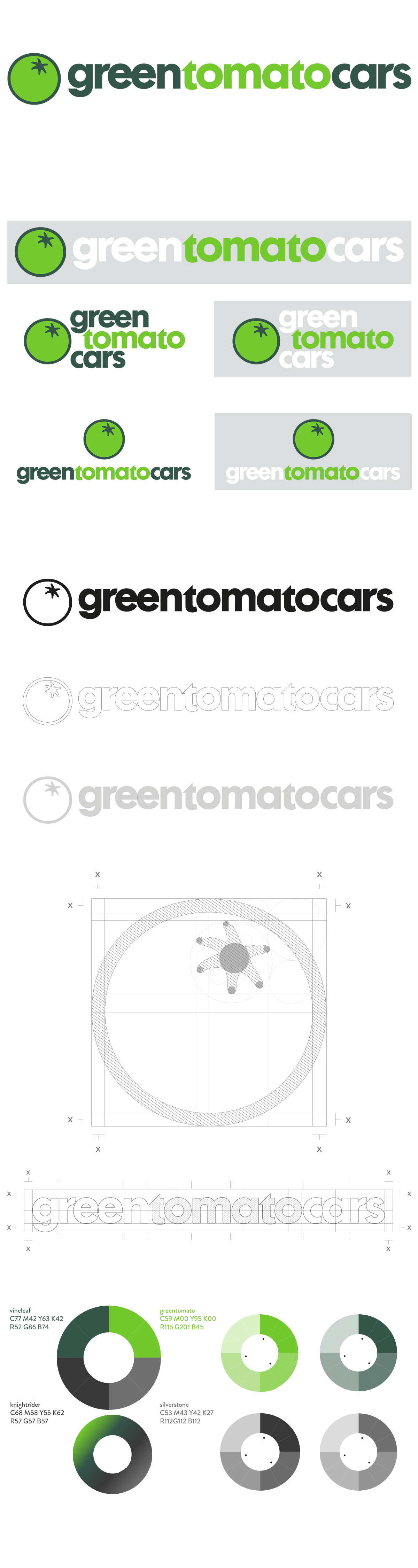
Logo Design: Georgia Cooke
Graphic Design: Cheng Sheng
Photography: Mark Mercer
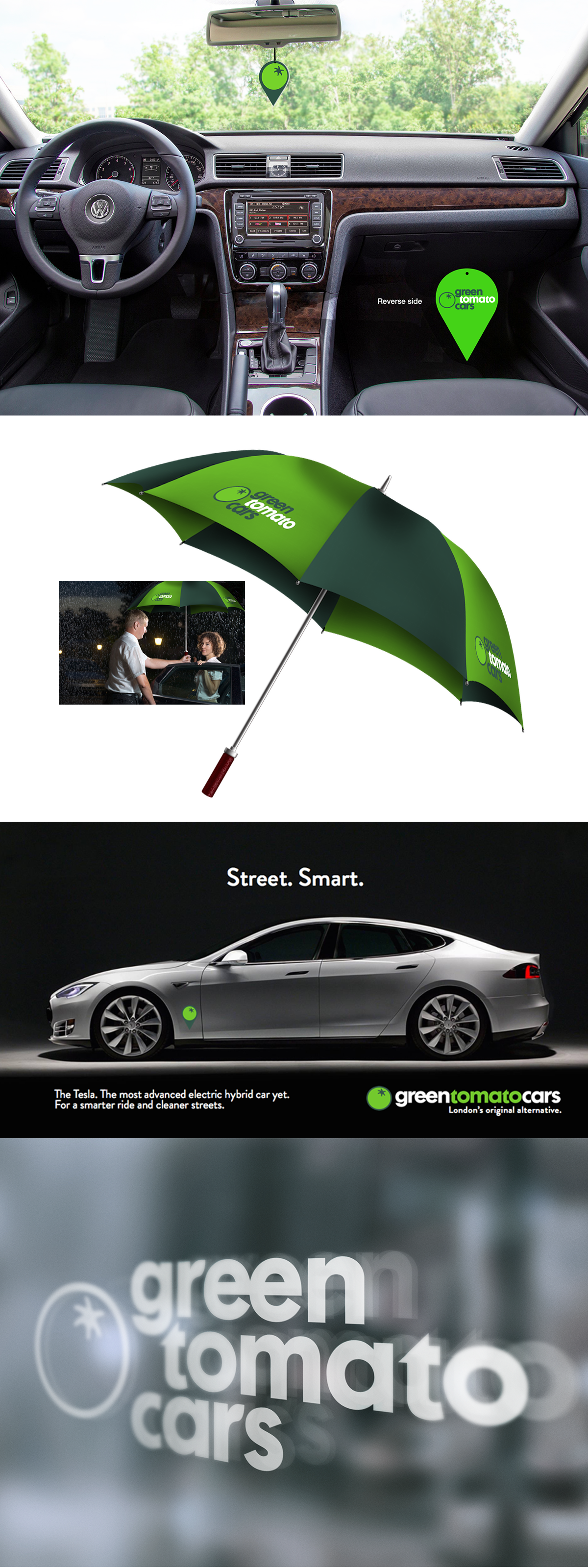
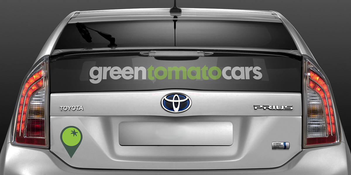
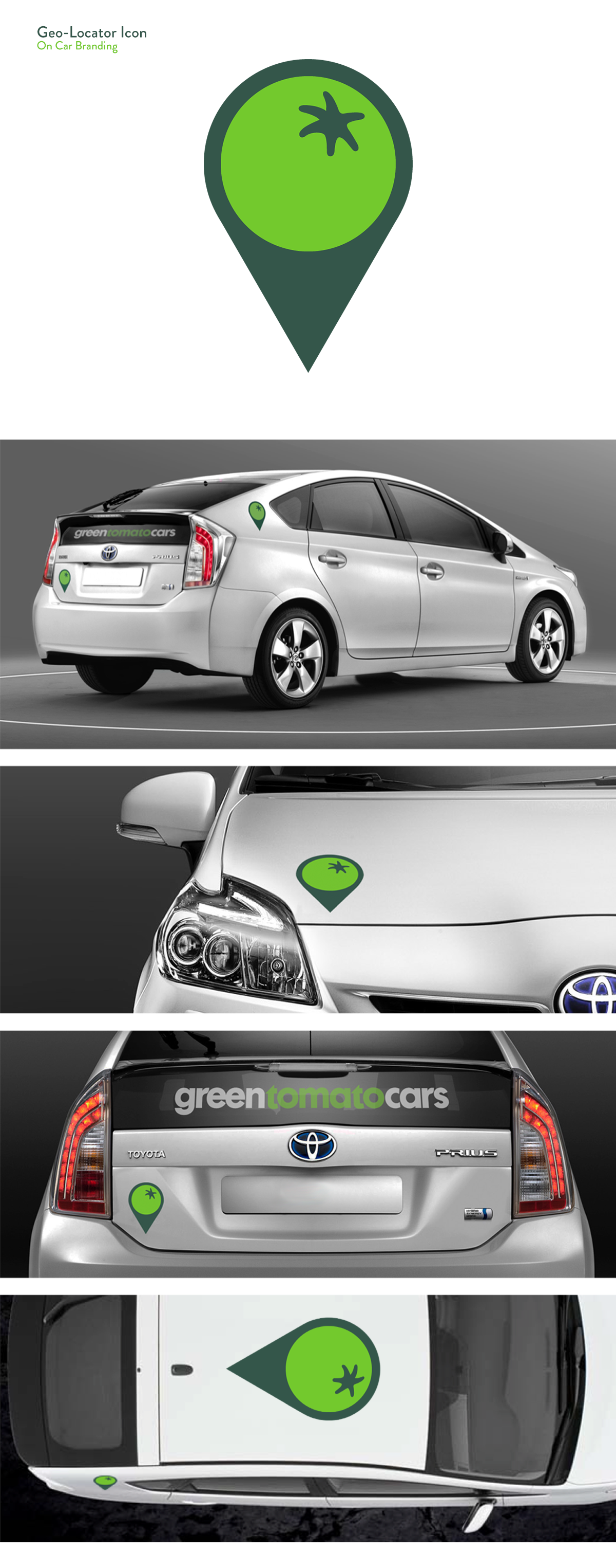
Car Branding
The car branding is the company's most visible asset. The geo-locator version of the tomato icon was developed specifically for use on the fleet. Using the locator device establishes the brand firmly in the world of 21st century technological development, crucial as the industry becomes more reliant on digital to operate succesfully.
The idea of the large locator on the roof of the cars, is both fun and practical, being a literal realisation of the indicator on your phone cab app, and also useful for spotting a waiting cab from your office window.
Stationery Assets
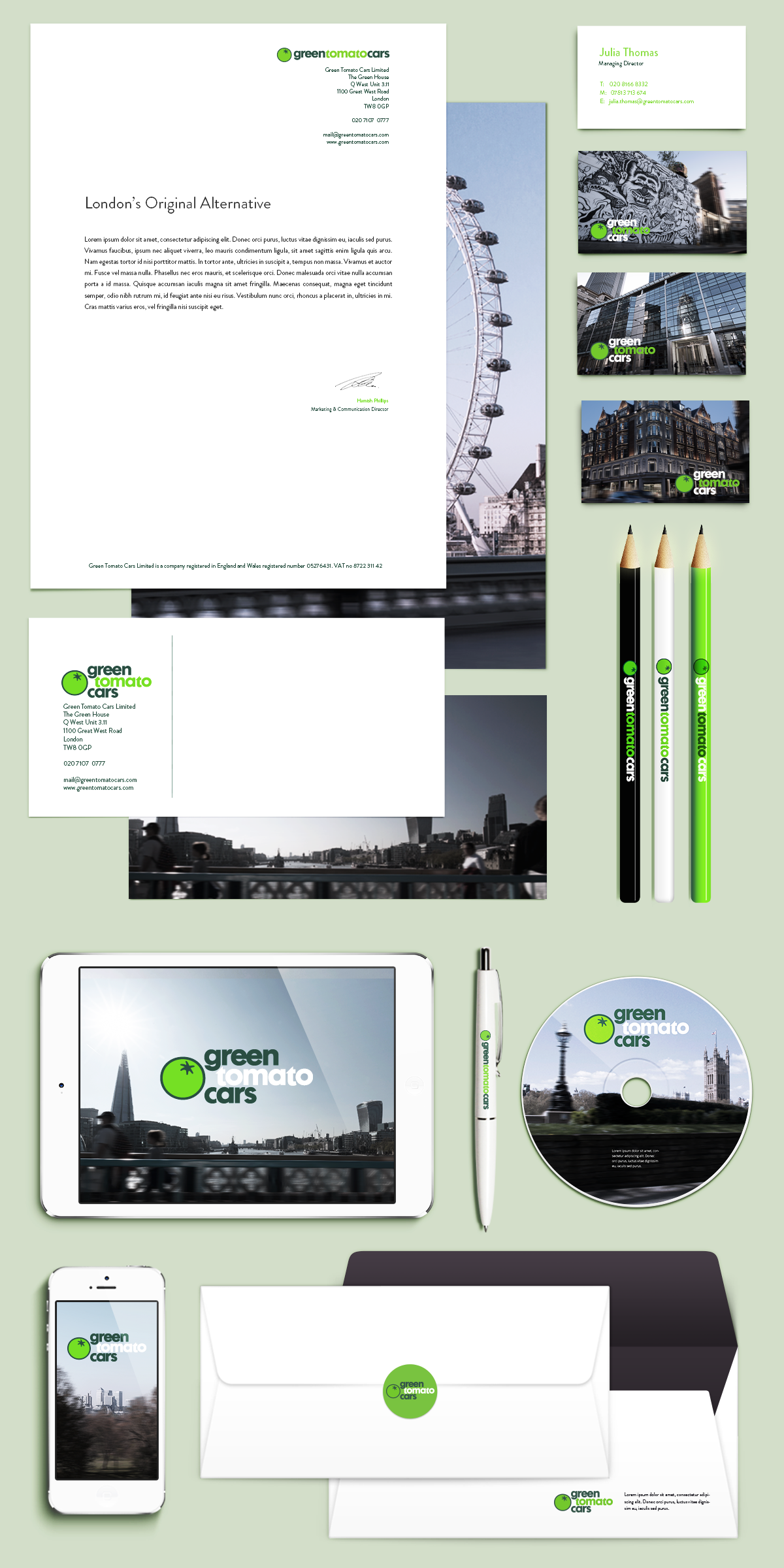
Photography
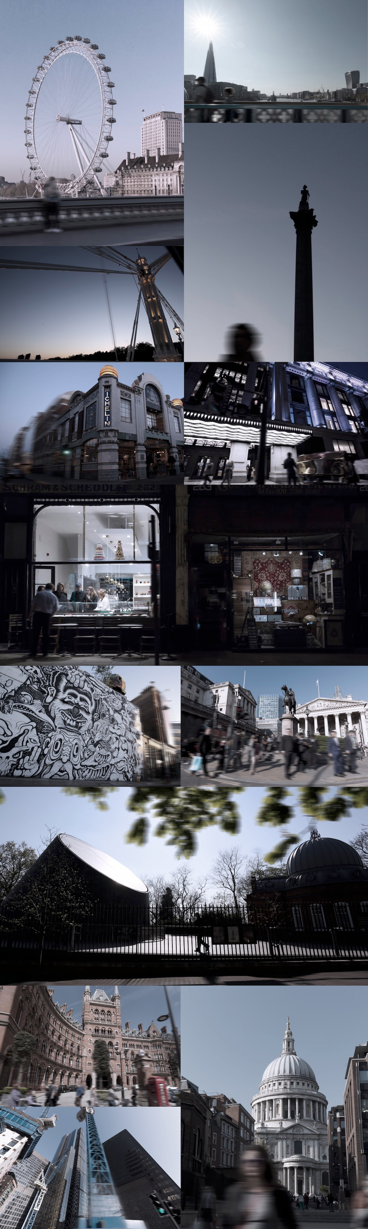
Photography plays a big part in the new brand refresh, offering the opportunity to portray the city that is close to the heart of greentomatocars, to demonstrate their knowledge and love of London, and the connection to its streets and environment, both in the geographic and environmental sense.
GTC are in the business of moving people around, so photography that is associated with the brand should have a sense of movement to it. It should have the feeling that it’s a great photo taken from the back seat of a GTC car, that’s whisking the
passenger across the city. So there is always a strong visual connection to what they do as a business.
Nuw produced a range of images for the launch, featuring the streets of London. The photographs are all taken from the passengers point of view and were shot over 6 days. the grading is reminiscent of the dark tinted glass of the car windows.
Digital Media
A large part of the reband dealt with the company's digital footprint. The design needed to work seamlessly across social media platforms as well as the newly overhauled app and website.

Marketing and Communications
Nuw also produced a number of branded assets, including a brand book/styleguide, car accesories and communications examples.